ggplot2: ボックスプロットを並び替える

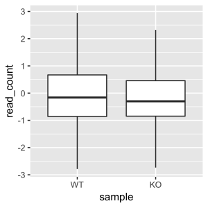
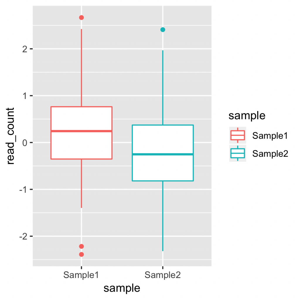
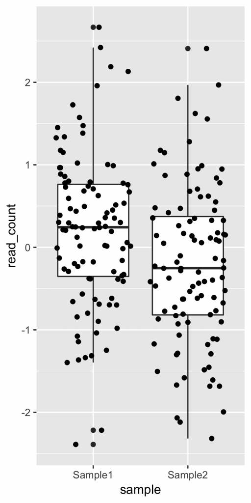
ggplot2 で、ボックスプロットを作成する時、x軸の並び(サンプルの並び)は、自動的にアルファベット順になります。これは、aes() に指定したパラメーターが自動的に factor 型の文字列として扱われるからです。

これは、gather のときに、並び替えたい順序に指定したとしても、変更することはできません。WT, KO の順に並んで欲しかったとしても、アルファベット順なので、 KO, WT の順になります。

plot_data <- input_data %>%
  gather(WT, KO, key = "sample", value = "read_count")

g <- ggplot(plot_data, aes(x = sample, y = read_count))
g + geom_boxplot()
WT, KO の順に並んで欲しかったが、、、

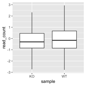
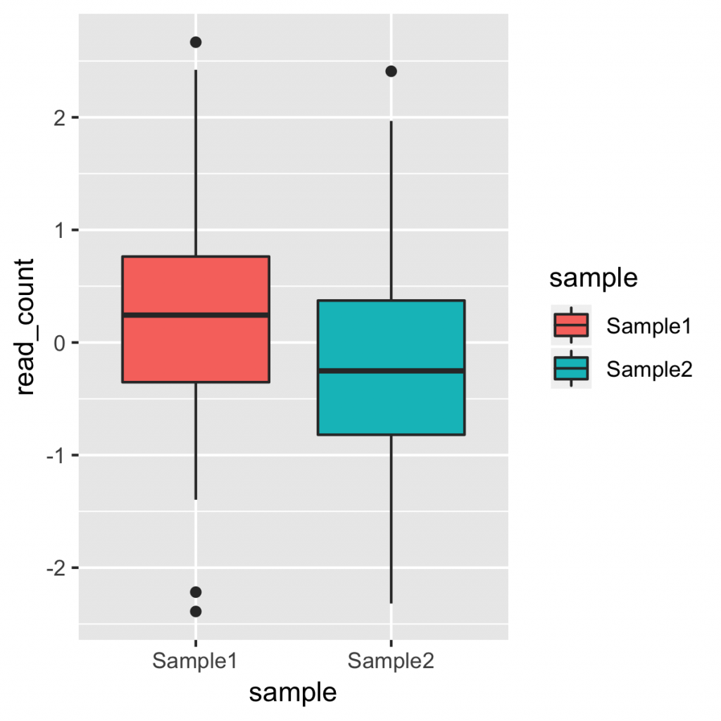
並び替えるには、gather 後に、サンプル列をレベルを指定した factor で上書きします。具体的には下記のような指定です。

plot_data <- input_data %>%
  gather(WT, KO, key = "sample", value = "read_count") %>%
  mutate(sample = factor(sample, levels = c("WT", "KO")))

# 従来の書き方だと、下記のように書けます。
# plot_data$sample <- factor(plot_data$sample, levels = c("WT", "KO"))

これで、WT、KO の順に並べることができました。

並びを指定した場合
 

ggplot2: レジェンド(凡例)を消す

ggplot2 では、プロットに色付けをすると、自動的にレジェンド(凡例)も表示されます。これが不要な場合、非表示にするにはテーマ theme() 関数で変更を行います。 legend.position に “none” を指定すると非表示にできます。

theme(legend.position = "none")

gg <- g + geom_boxplot() + scale_fill_brewer(palette = "Spectral")
gg + theme(legend.position = "none")
レジェンドを非表示にした例

テーマで変更できる項目は下記にあります。

Modify components of a theme

https://ggplot2.tidyverse.org/reference/theme.html
 

ggplot2: マニュアルで色を指定する

aes() オブジェクトに color または fill を指定すると、グループに応じて色付けできます。このとき、色をマニュアルで指定するには、 scale_color_manual() または scale_fill_manual() を用います。 ggplot の aes() に fill を指定したのち、geom_boxplot() のあとに、プラス (+) で続けて指定します。

scale_fill_manual(values = c(色1, 色2, ...))

コードの例:

g <- ggplot(plot_data, aes(x = sample, y = read_count, fill = sample))
g + geom_boxplot() + scale_fill_manual(values = c("salmon", "royalblue"))
マニュアルで色を指定した例

複数の色を指定するには、予め定義されたパレットを用いると便利です。 RColorBrewer のパレットを使える scale_fill_brewer() 関数があります。

g + geom_boxplot() + scale_fill_brewer(palette = "Spectral")
scale_fill_brewer の例。

brewer のパレットに指定できる色の例です。YlOrRd, YlOrBr, Set1, Set2, Dark2, Spectral などがあります。(文字列として指定するので、ダブルクオーテーションで囲むのを忘れずに。)

RColorBrewer より。

scale_color_manual, scale_fill_manual()

https://ggplot2.tidyverse.org/reference/scale_manual.html
 

ggplot2: ボックスプロットに色を付ける

ggplot2 では、あるパラメーターごとに色付けすることが簡単にできます。色付けするには、aes() の指定時、 color にパラメーターを指定します。サンプルごとに異なる色を付けるには、下記のように指定します。

g <- ggplot(plot_data, aes(x = sample, y = read_count, color = sample))

自動的に選択された色で、色づけされます。

一方、ボックスプロットの枠ではなく、中身を色付けしたい場合は、 color ではなく、 fill で指定します。

g <- ggplot(plot_data, aes(x = sample, y = read_count, fill = sample))

コードの例:

input_data <- tibble("Sample1" = rnorm(100),
                     "Sample2" = rnorm(100))

plot_data <- input_data %>%
  gather(Sample1, Sample2, key = "sample", value = "read_count")

g <- ggplot(plot_data, aes(x = sample, y = read_count, fill = sample))
g + geom_boxplot()
ggsave("boxplot_image_fill.png", width = 4, height = 4, unit = "in")
 

ggplot2: ボックスプロットにドットプロットを重ねる

ggplot2 を使うと、ボックスプロットに、ドットプロットを重ねて描画することもできます。バイオリンプロットのときと同様に、 geom_boxplot()geom_dotplot()+ で続けて指定します。

g + geom_boxplot() + geom_dotplot()

g は、ggplot のオブジェクトです。具体的には、下記のようなコードです。

input_data <- tibble("Sample1" = rnorm(100),
                     "Sample2" = rnorm(100))

plot_data <- input_data %>%
  gather(Sample1, Sample2, key = "sample", value = "read_count")

g <- ggplot(plot_data, aes(x = sample, y = read_count))

g + geom_boxplot() +
  geom_dotplot(binaxis = "y", stackdir = "center", binwidth = 0.1)

下記のようなイメージが出力されます。

ボックスプロットにドットプロットを重ねた例。

なお、ドットを整列させない場合は、 geom_jitter() 関数を用います。

g + geom_boxplot() + geom_jitter()

ドットが横方向にランダムに描画されます。ランダムな結果なので、実行するたびにドットの位置が変化します。(見た目だけの問題なので、ばらつきに意味はありません。)geom_point(position = “jitter”) でも同様です。

geom_jitter の例。